Responsive and Adaptive Web Design
What do we mean when we say:
Responsive?
Let's first off define what responsive and adaptive actually mean.
responsive
adjective | re·spon·sive | \ri-ˈspän(t)-siv\
: reacting in a desired or positive way
adaptive
adjective | adap·tive | \ə-ˈdap-tiv, a-\
: showing or having a capacity for or tendency toward adaptation
adaptation
noun | ad·ap·ta·tion | \ˌa-ˌdap-ˈtā-shən, -dəp-\
: the process of changing to fit some purpose or situation
: the process of adapting
Responsive reacts to a situation
Adaptive adapts to a situation
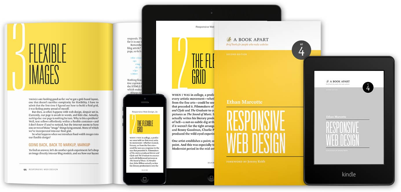
Responsive Web Design
Ethan Marcotte ©2011
Ethan Marcotte coined the term “responsive web design”
… The technologies existed already: fluid grids, flexible images, and media queries.
Responsive Web Design
- The Flexible Grid
- Flexible Images
- Media Queries
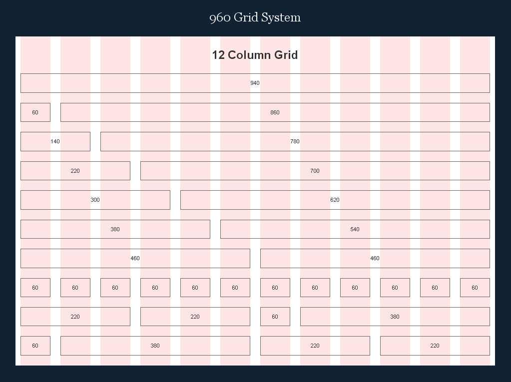
The Flexible Grid
Fluid grids that ebb and flow with a devices’ screen size.
“Nasty, evil pixels. We hates them.”
target ÷ content = result
Say we have a 960 grid and want to add a content container of 900 pixels in our grid.
900 ÷ 960 = 0.9375
.foo-content {
  margin: 0 auto;
  width: 93.75%; /* 900px / 960px */
}
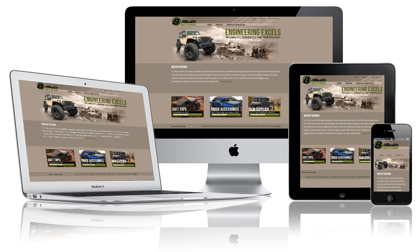
Flexible Images
Flexible images and media that keep content intact on any resolution.
img, embed, object, video {
  max-width: 100%;
}
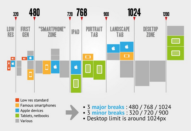
Media Queries
Media queries allowing designs to respond by establishing dimension breakpoints.
Media Queries
/* Smartphones (portrait and landscape) ----------- */
@media only screen and (min-device-width : 320px)
and (max-device-width : 480px) {
/* Styles */
}

/* Tablets (portrait and landscape) ----------- */
@media only screen and (min-device-width : 768px)
and (max-device-width : 1024px) {
  /* Styles */
}

/* Desktops and laptops ----------- */
@media only screen  and (min-width : 1224px) {
  /* Styles */
}
The crux of Responsive
Responsive web design is a means of becoming device agnostic in the sense that it seeks to create an optimized experience for any screen.
Adaptive Web Design: Crafting Rich Experiences with Progressive Enhancement
Aaron Gustafson ©2011
Adaptive Web Design
- The Flexible Grid
- Flexible Images
- Media Queries
Progressive Enhancement
“Progressive enhancement is an approach to web development that aims to deliver the best possible experience to the widest possible audience — whether your users are viewing your sites on an iPhone, a high-end desktop system, a Kindle, or hearing them on a screen-reader, their experience should be as fully featured and functional as possible.”
What now?
How are they the same?
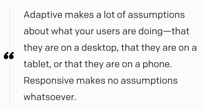
Responsive sites and adaptive sites are the same in that they both change appearance based on the browser's width.
How are they different?

The responsive example on top flows, the adaptive example on bottom snaps into place.
How are they different?
Responsive websites respond to the size of the browser at
any given point.
Adaptive websites adapt to the width of the browser at
a specific points.
Examples in play:
Choosing Between the two
| Responsive | Adaptive |
|---|---|
| Aimed at crafting sites to provide an optimal viewing experience—easy reading and navigation with a minimum of resizing, panning, and scrolling—across a wide range of devices. | Instead, there are several distinct layouts for multiple screen sizes, and the layout used depends on the screen size used. |
| Relying on flexible and fluid grids. | Relying on predefined screen sizes. |
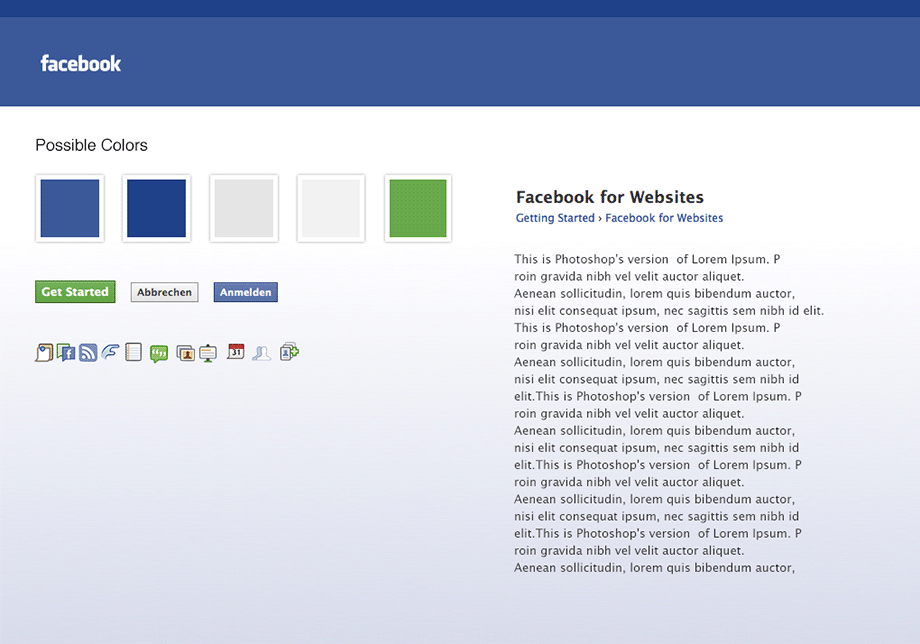
Why is this important?
...because otherwise this happens:

THE END?
No, we're just getting started.
Identifying the breakpoints
| Responsive | Adaptive |
|---|---|
| The design process kicks off with a mobile first approach. | The design process kicks off by surveying the different devices for which we're planning to design. |
“Start with the small screen first, then expand until it looks like shit. Time for a breakpoint!” – Stephen Hay
Content
Layout should follow the Content #contentisking
e.g. Text should be bigger on mobile devices, not smaller.
Content Groups
Don't split Content Groups.
Content Groups
Don't split Content Groups.
Changing the order of elements is always complicated.
Images
Image formats should be the same, if possible.
The content of images is relevant for different screen sizes.
Performance
You never know where the user is and which bandwidth is available
You never know where the user is and which bandwidth is available.
Small screensizes = low bandwidth.
Large screensizes = high bandwidth.
Check file sizes
Loading time.
Device performance.
Device Performance
Fancy animations / Parallax can kill the whole User Experience.
Mobile First
Great for Conception
No risk to create stuff that is not working on small screens -> shrink Desktop Modules for smaller screens
If it works on the Smartphone, it works on the Desktop.
The hardest work is over :)
Focus / Reducing unnecessary modules -> "We don't need that on the Smartphone" So do we REALLY need it on the Desktop?
Designers are often struggling with this approach
Linear structures, limited view, no space.
Design modules, not sites.
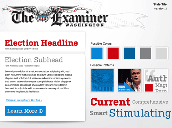
Creating Style Tiles. (http://styletil.es/)
Workflow
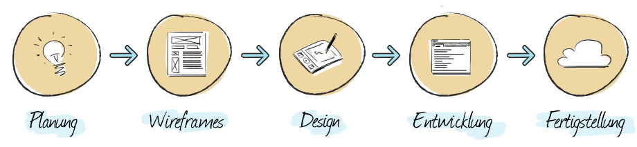
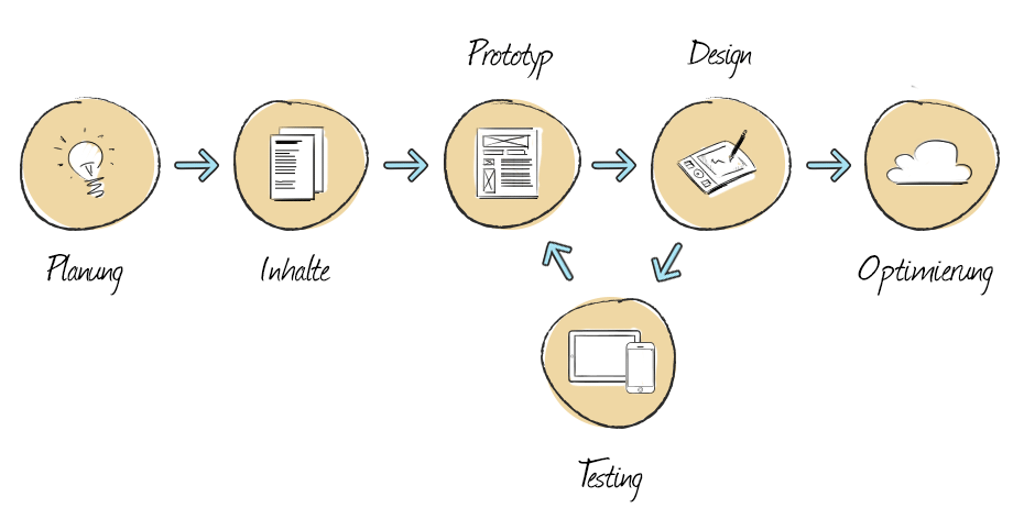
Concepters, Designers and Programmers should meet as soon as possible and talk a lot.
Trends
Flat / Material Design
Minimization of UI elements.
Drop embellishments.
Reducing unnecessary elements
Fast loading, Good usability
Typography
With or without images.

Large Navigations

Infinite scrolling
Fast navigation, nice for browsing
Storytelling
Background video, large images, sound

Split Content / Card Design
Divide Website into sections.
Sooo... what's better?
Responsive or Adaptive?
It depends on the project.
Responsive is more powerfull and more flexible.
But Adaptive is pixelperfect and cheaper.
Thanks for your attention!
Here is a funny cat.

Questions?